One Week On Waze San Francisco by Roque Leal
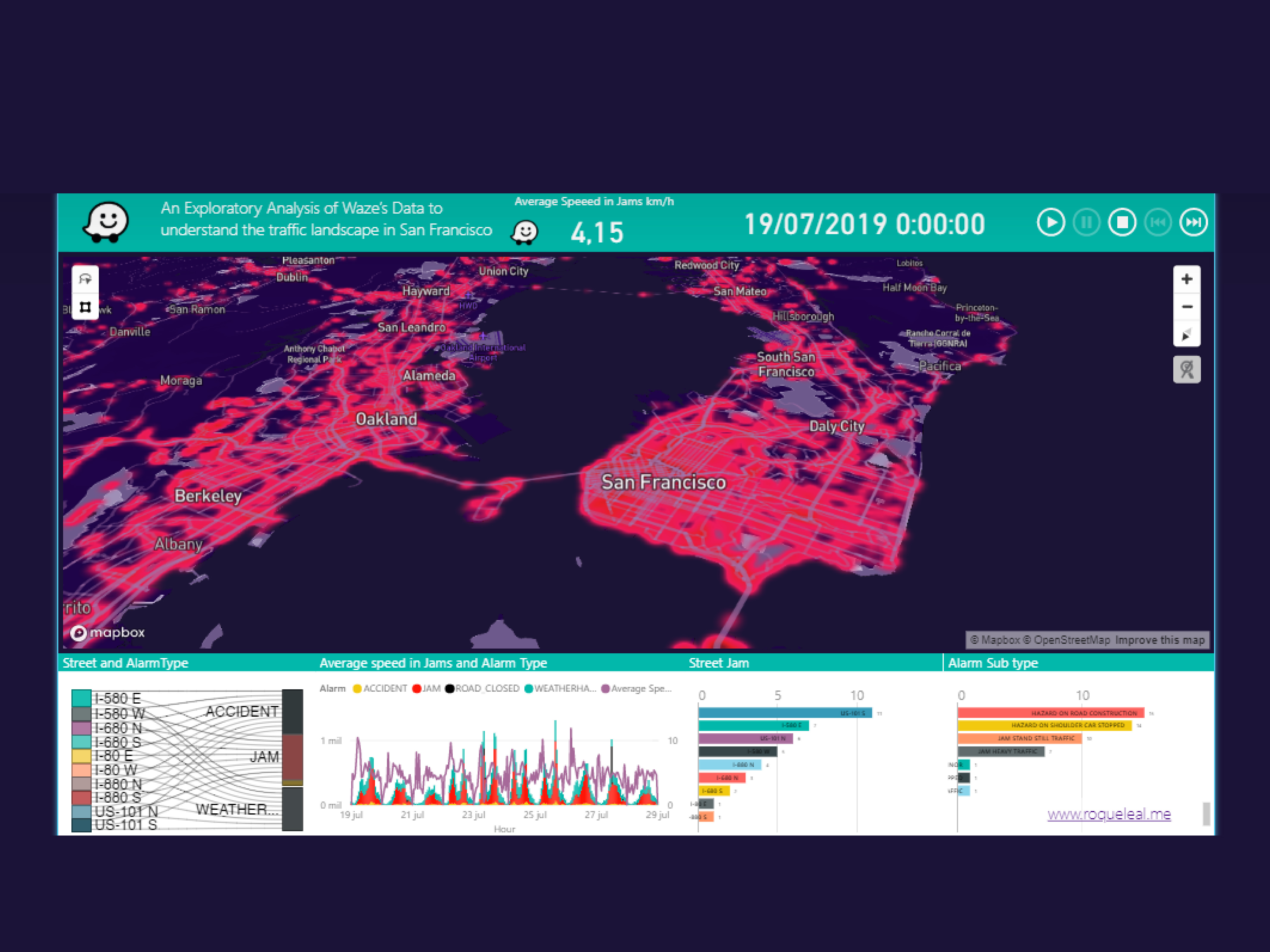
I've focussed on data and the opportunities for better understanding cities in continuous movement, in this example, I’m having fun using Waze data with Python and R scripts in Power BI that interact in Mapbox Visual to analyse changes in intersection traffic and vehicle congestion in San Francisco over the span of a week.
This is animated so you can see the patterns over time and also it's possible incorporate the extrude 3D buildings that improve the visual experience. A heatmap of the relative city-level traffic jam volume shows subtle variations per hour while frequency graphs into dashboard change based on traffic alerts and street events, all in sync with the map view to give a dynamic view of our space updating all the time for unravelling the complex urban fabrics that form our cities.
The entrant has supplied multiple files for this work:
-
CreditsRoque Leonardo Leal Salcedo
-
Award
-
Categories
-
See more


