Water Scarcity Clock by World Data Lab
The entrant has supplied multiple files for this work [1] [2]
The Water Scarcity Clock is an interactive data visualization webtool created to raise awareness about the reality of water as a finite resource. The tool is aimed at the general public and policy-makers, designed to simplify the complex subject of water scarcity in a compelling way.
The tool was created by the World Data Lab in partnership with the International Institute of Applied Systems Analysis (IIASA) and commissioned by the Deutsche Gesellschaft für Internationale Zusammenarbeit (Federal Ministry for Economic Cooperation and Development of Germany).
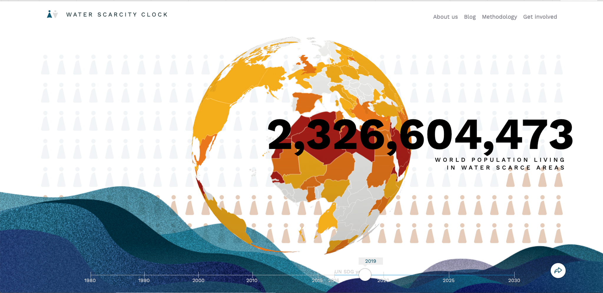
The Water Scarcity Clock visualizes the number of people living in water scarce areas around the world from 1980 to 2030. There are two interactive sections that help tell this story. In the first section, users are greeted with a spinning globe behind a live-ticking headline number. Under the globe is an interactive timeline. The headline number counts the number of people that are affected by water scarcity. The timeline allows users to explore data for different years.
The second major section of the tool is an interactive map section. Here, water availability numbers are dynamically present the percentage of local populations living in areas within different thresholds of scarcity. The thresholds are based on the commonly used Falkenmark Index which measures the amount of renewable fresh water available for every person each year. We use 3 thresholds, absolute water scarcity (less than 500m³ of water), water scarcity (500-1000m³ of water) and water stress (1000-1700m³ of water). All three are visually represented on the map itself and within the “water card” view for each country.
The user can choose between three different lenses to view the world map. Each lens reveals an important angle on water scarcity. The three lenses are overall water availability, water availability during the driest month, and population density.
Both water availability maps break geographies into grids. Breaking down the world map into grids and allowing users to zoom into 50km x 50km geographic areas helps highlights the regional and local aspect to water scarcity. Although a country overall may not be water scarce, there can be areas within the country where people are struggling with less than 500m³ water available in a year. The inverse can also be true. Some countries will appear water scarce while most of the population may live close to an accessible water source. The zoom feature and color doing showcases these nuances well.
The “water availability during the driest month” map highlights an important fact that a sizeable percentage of world’s population suffers from absolute water scarcity for at least one month of the year, emphasizing that water scarcity is a global issue.
For each country there is a corresponding “water card” popup with greater detail. Each water card contains the total population, the driest month for that country, the number of people in that country living in water scarcity, and the number of people living in different thresholds of water scarcity.
-
CreditsInternational Institute for Applied Systems Analysis (IIASA)
-
Award
-
Categories
-
See more


