Religious Identity by Ben Flanagan
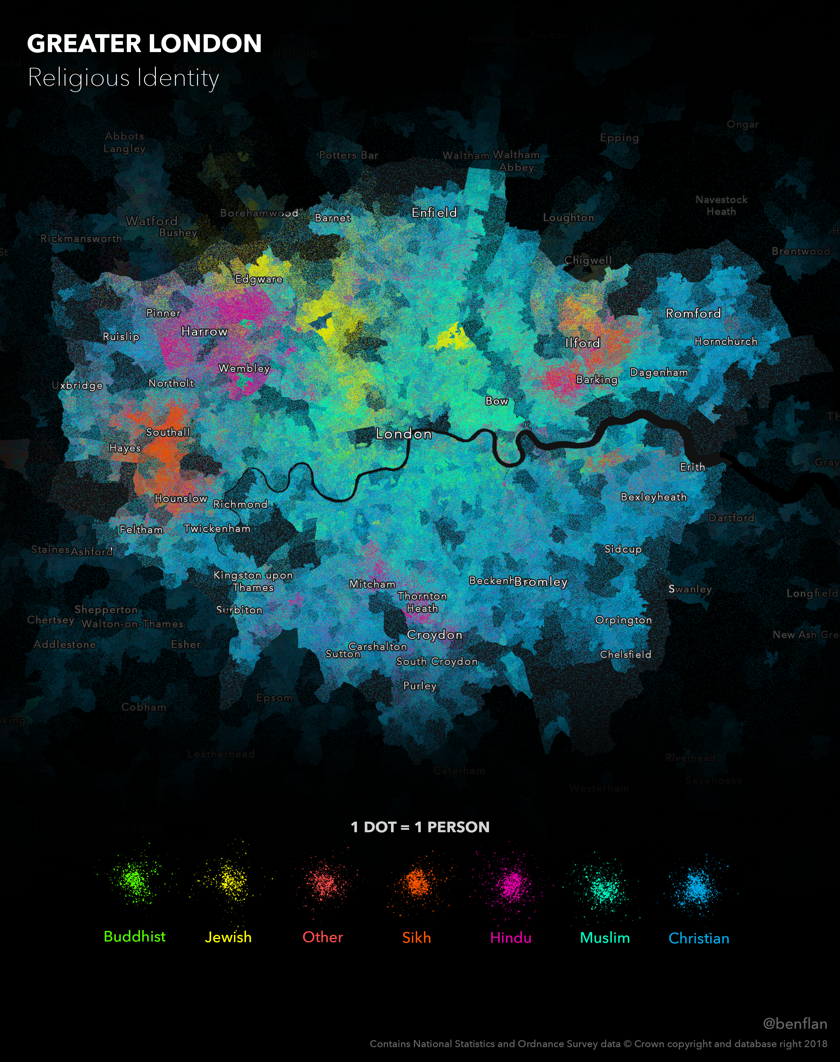
This is a dot density map of religious identity across Greater London. Using data from the 2011 Census, I was able to represent each person as a single dot - that's almost 7 million for London alone! I applied colour to reveal religious allegiance, making the map a multivariate dot density.
Dot density maps are really effective at normalising data by geographic area. This is because places with fewer people fade away, while densely populated areas become more prominent. These visualisations help to reveal hidden patterns, or in this case, communities. They not only look interesting, but help to make the data more meaningful.
Historically, London has been predominantly Christian. This is evident as the map is a sea of blue. Islam, London's second largest religion and represented here as turquoise, seems to have a greater following north of the River Thames. The map also reveals large Jewish, Hindu and Sikh communities - all found to the north and west of the capital.
I didn't include those who don't identify as religious - the idea of the map was to show religious communities.
-
CreditsBen Flannagan
-
Award
-
Categories
-
See more


