École Polytechnique Fédérale de Lausanne (EPFL) by EPFL
Academic affinities are one of the most fundamental hidden dynamics that drive scientific development. Some affinities are actual, and consequently can be measured through classical academic metrics such as co-authoring. Other affinities are potential, and therefore do not have visible traces in information systems; for instance, some peers may share scientific interests without actually knowing it.
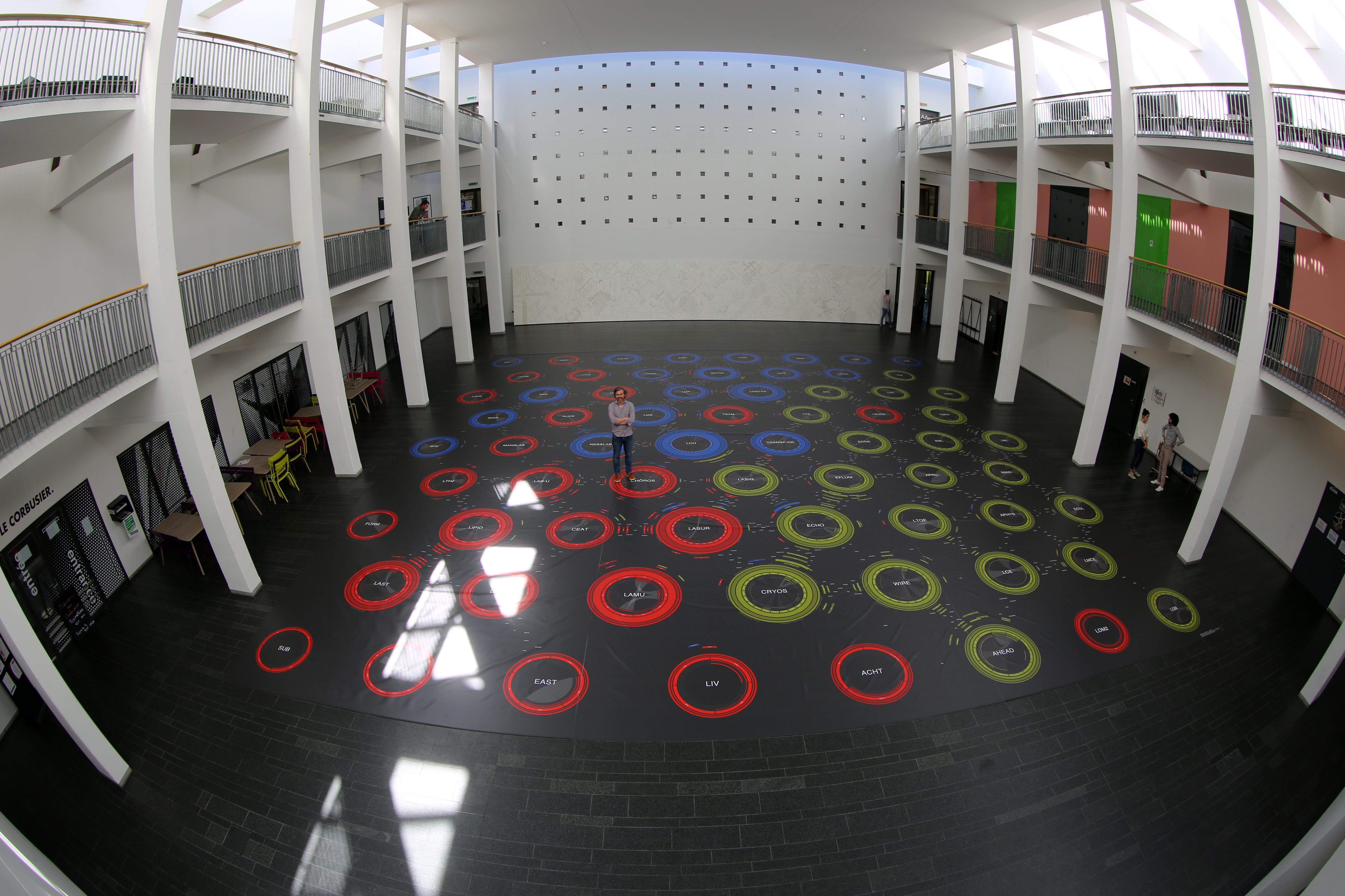
This visualization is a map of affinities for scientific collectives. The case study involves the School of Architecture, Civil and Environmental Engineering of EPFL, which consists of three institutes, seventy laboratories, and around one thousand employees. The actual affinities are modeled using the data available from the academic systems reporting publications, teaching, and advising, whereas the potential affinities are addressed through text mining of the documents registered in the information system.
The major challenge for designing such a map is to represent the multi-dimensionality and multi-scale nature of the information. The affinities are not limited to the computation of heterogeneous sources of information, they also apply at different scales. Therefore, the map shows local affinities inside a given laboratory, as well as global affinities among laboratories.
The visualization presents a graphical grammar to represent affinities. This graphical system is actualized in several embodiments, among which a large-scale carpet of 250 square meters, and an interactive online system in which the map can be parameterized.
In both cases, we discuss how the actualization influences the representation of data, in particular the way key questions could be appropriately addressed considering three target audiences: the insights gained by the management and the relative decisions, the understanding of the researchers own positioning in the academic collective that might reveal opportunities for new synergies, and eventually the interpretation of the structure from an external standpoint that suggesting the relevance of the tool for communication.
-
CreditsThe Affinity Map is a project launched and promoted by the Dean of ENAC, Prof. Marilyne Andersen. The current design was at the core of a PhD thesis conducted by Dario Rodighiero within the domain of Digital Humanities under the supervision of Prof. Frédéric Kaplan (DHLAB at EPFL) and Prof. Boris Beaude (ISS at UNIL). Design and front-end development: Dario Rodighiero Architecture and development: Ogier Maitre Server and data maintenance: Jean-Daniel Bonjour, Samuel Bancal and Nicolas Dubois Project management: Marie-Christine Buluschek and Antoine Guillemin Supervision: Prof. Marilyne Andersen, Prof. Frédéric Kaplan, and Prof. Boris Beaude Many thanks to colleagues who differently contributed to this project, listed here in alphabetical order: Consuelo Antille, Lauren Bolli, Vincent Buntinx, Pierpaolo Follia, Melany Gilis, Alexandre Gonzalez, Jean-Robert Gros, Claudio Leonardi, Cristina Perez, Orlin Topalov, and Cyril Veillon.
-
Award
-
Categories
-
See more


