The Shape of Slavery by Radical Cartography
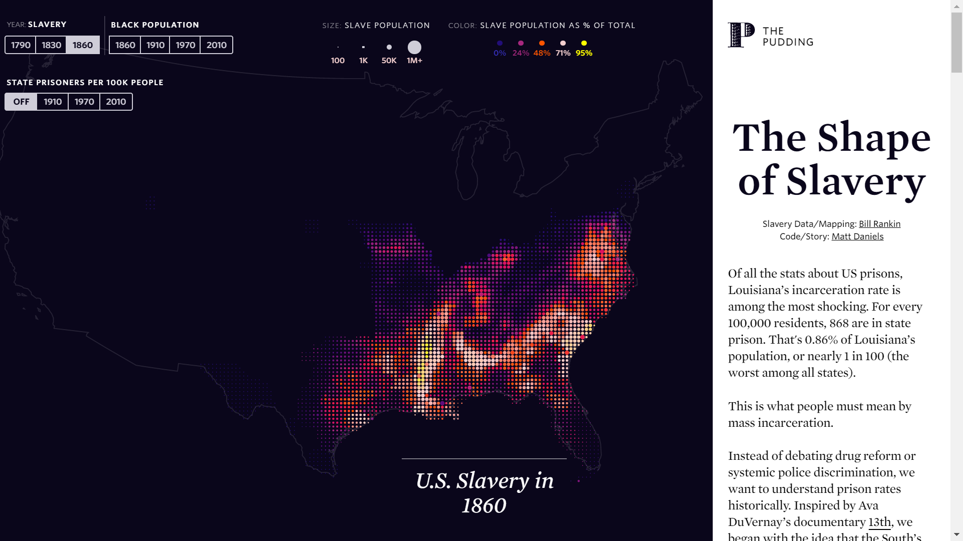
This project has two goals. One is to show the remarkable relationship between the historical geography of American slavery and the present-day patterns of mass incarceration. But second, the maps also show slavery in a new way: instead of a jigsaw puzzle of solid-colored counties (with cities completely invisible), population is shown with what I call a “bubble grid.” This allows raw numbers and relative rates to be shown at the same time; it also highlights cities in a new way.
Bill Rankin first developed this mapping technique for a non-interactive series of maps on his own website: http://www.radicalcartography.net/slavery.html
-
Creditsby Bill Rankin. Code/Story by Matt Daniels
-
Award
-
Categories
-
See more


