Uber Vs Cabs by David Roberts
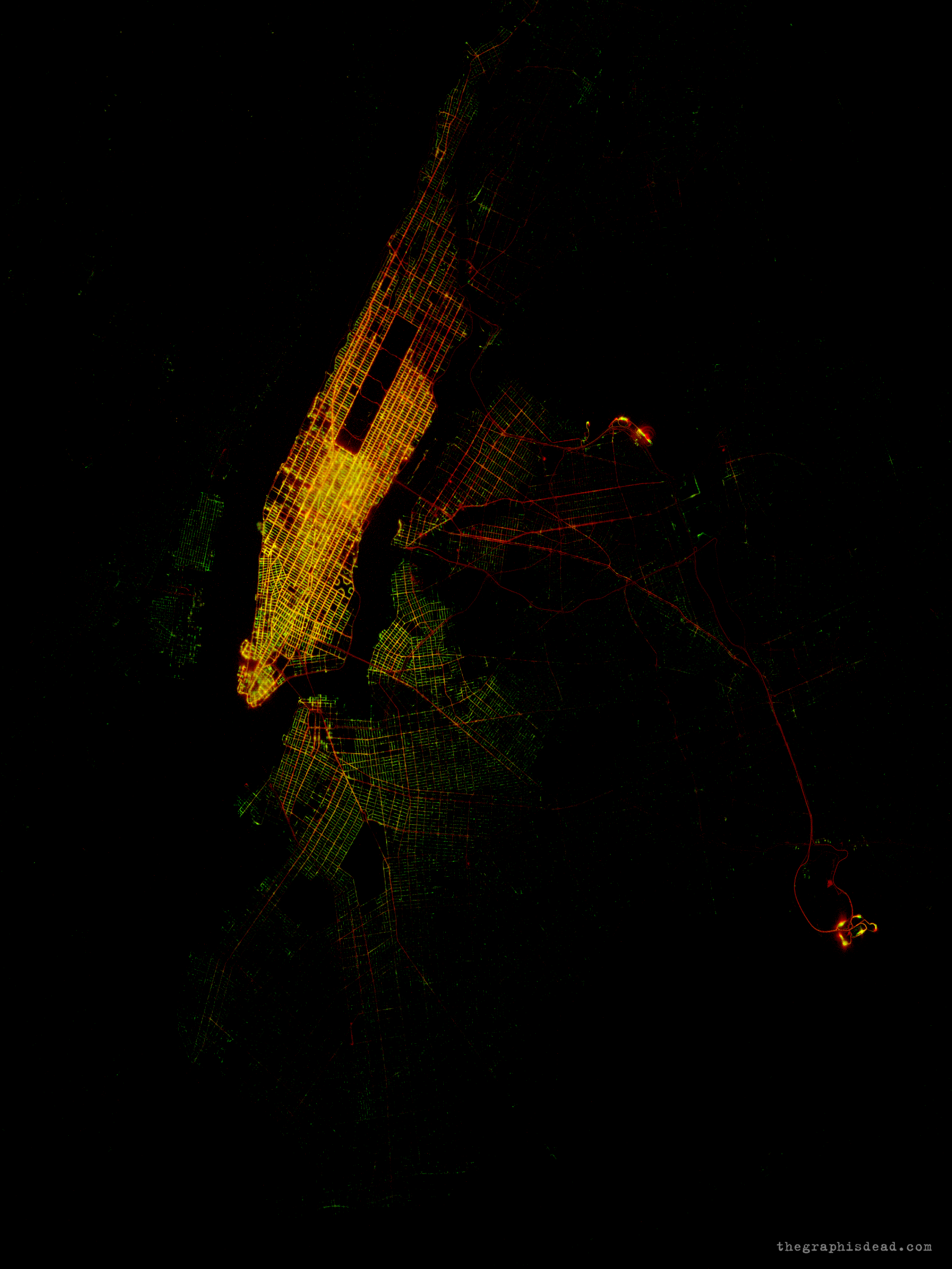
All 4.5 million Uber pick-ups, and 82.4 million yellow cab pick-ups between April and September 2014. The rise of Uber is well documented, but the geographic complexity is often harder to see as the context and requirements of each area vary so quickly. Even within the confines of an airport the distinctions between Uber and Yellow Cabs can be seen.
Uber data obtained via FOI request (https://github.com/fivethirtyeight/uber-tlc-foil-response) and Yellow Cab data available at https://nycopendata.socrata.com/. These are added to the image with a log-scale to bring out areas where there are clear differences. Uber pick-ups in green and Yellow Cab pickups in yellow. Red therefore is when the two pick-up densities are similar.
Interestingly, artefacts from the interference in GPS position introduced by the tall buildings of Manhattan can be seen as some pick-up locations seem to be in the water. Also, in this image at LaGuardia airport there seems to be a resonant radial artefact in the GPS positions, presumably from a radar tower. What causes the wave-like nature in this image is not clear.
-
CreditsDave Roberts
-
Award
-
Categories
-
See more


