Spain national Budget Visualized (2008-2013) by Carlos Gámez Kindelán
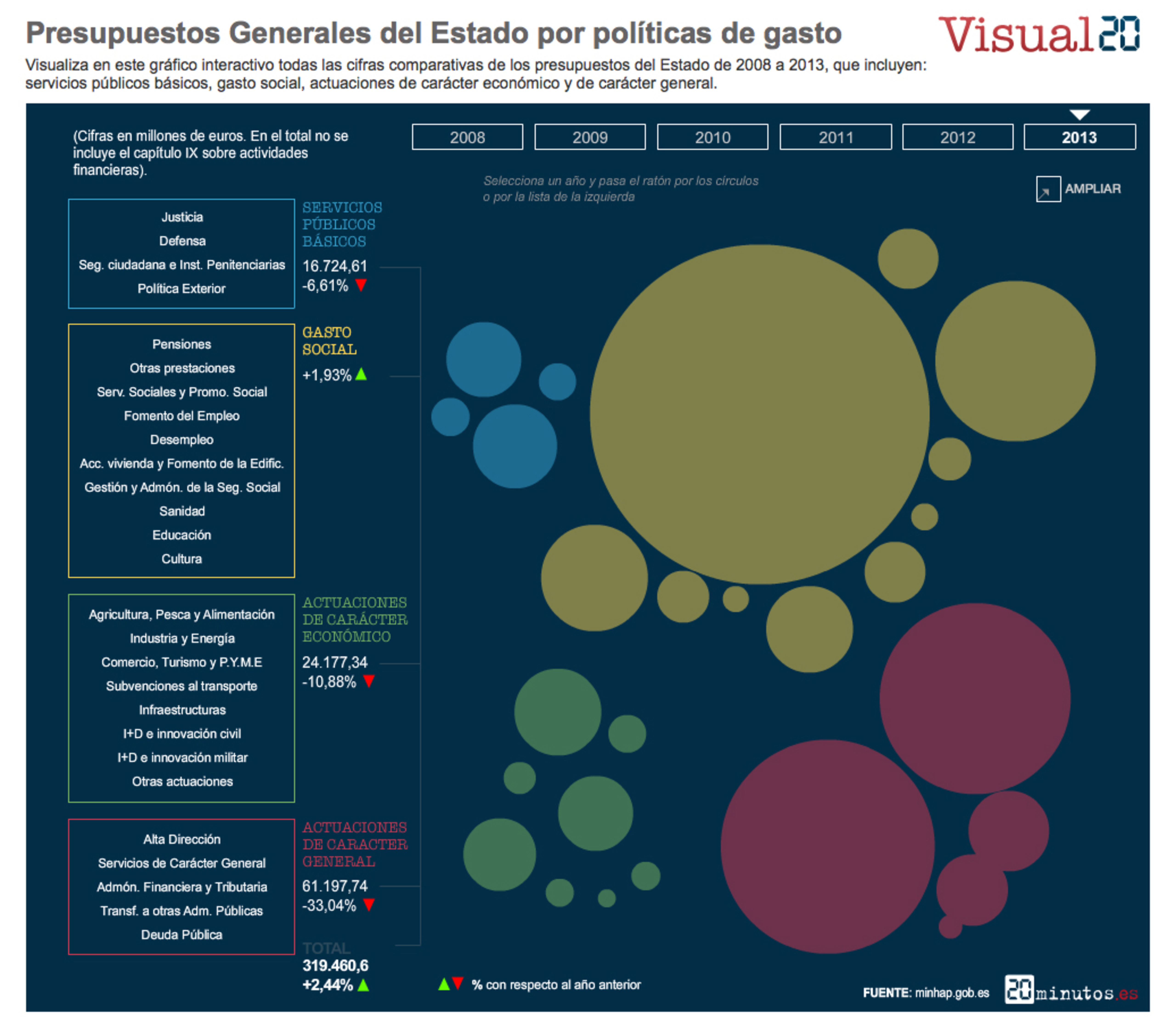
This interactive visualization shows comparative data about national budget from 2008 to 2013. Each color represents the different politics of cost. Blue color, for public services costs; yellow color, for social costs; green color, for other economic resources; and red color, for general economic services. The graphic displays a double navigation for each year. You can navigate roll over the firts column at the left, and also navigate roll over the different bubbles.
The piece allows to switch full screen mode at the right top of the graphic (AMPLIAR).
-
CreditsCarlos Gámez Kindelán
-
Award
-
Categories
-
See more


