3D Map of 2013 Unemployment Rates by County by Hunter College
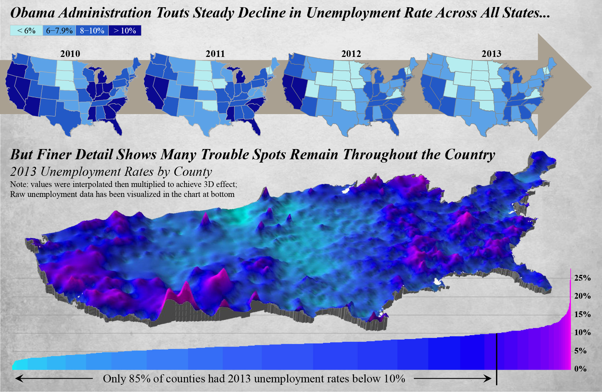
This was my final project for a cartography course during my GIS certificate program at Hunter College a couple years ago. I knew I wanted to do a 3D "topographical" map and I had worked with county-level statistics for a previous course, so I chose to visualize the mountains and valleys of unemployment by county. Made it look like it was in the NY Times just for fun. Also including my first draft where I used normal terrain colors but my professor suggested I change the color scheme to emphasize that this is something other than a normal elevation map.
-
Credits
-
Award
-
Categories
-
See more


