The better life snowflake by Paula Filippone
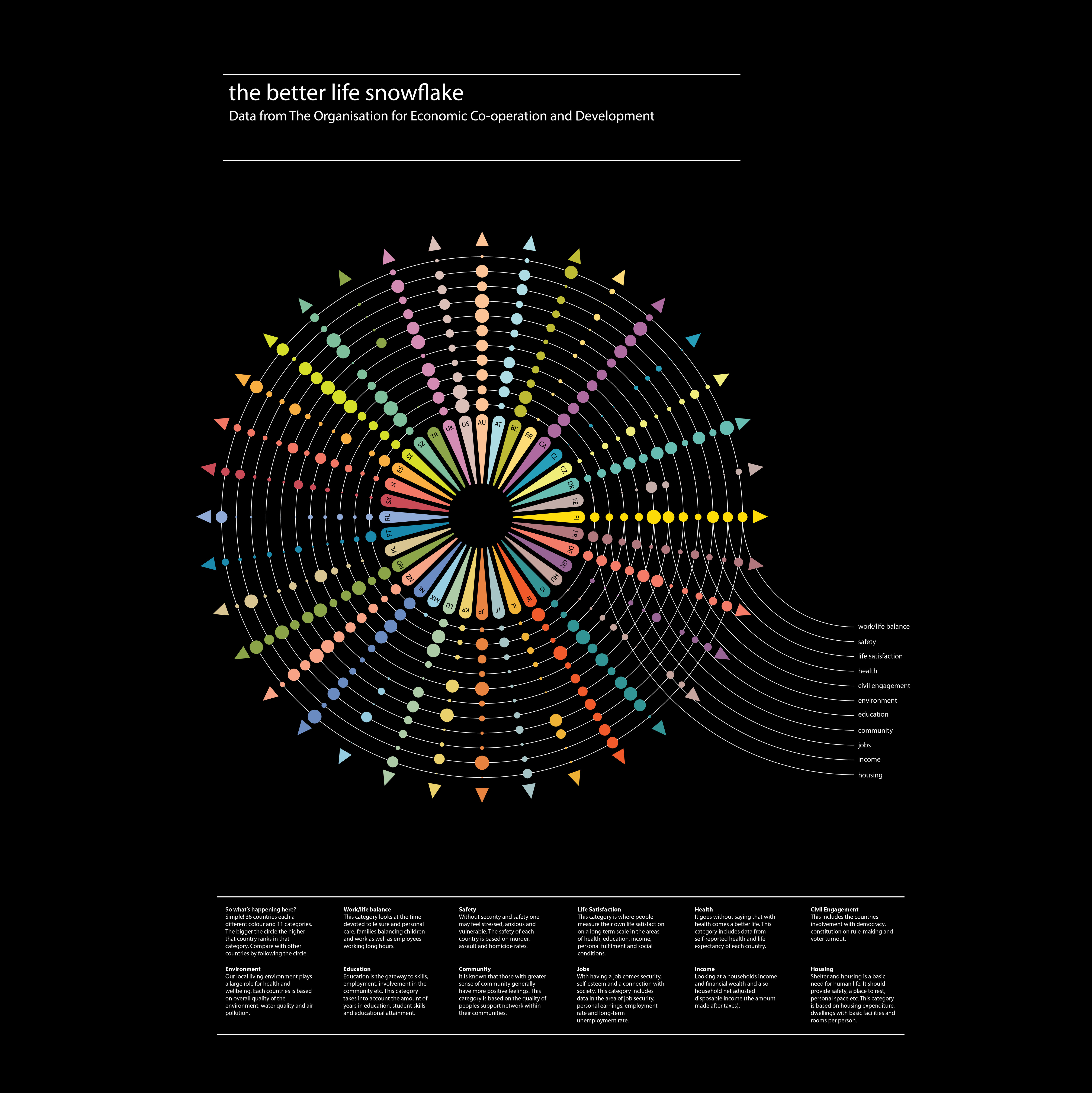
–The Better Life Snowflake' uses the data from OECD Better Life Index. This website shows data by either country of category. I wanted to simplify that data even more by using one image. To do this I made a wheel with 36 countries each getting an individual spoke, represented in a different colour. Each country has 11 bubbles representing the 11 different categories such as: jobs, environment, income, housing etc.
The size of the bubble represents where that country ranks within that category. Therefore the bigger the bubble the higher they rank and the smaller the bubble the lower they rank.
-
CreditsPaula Filippone
-
Award
-
Categories


