
These infographics show the constellations of various countries around the world. The data used to create the maps draws on areas of artificial brightness, which occludes the visibility of stars in...
-
 View projectMaking important decisions is part of everyday life, yet understanding how people arrive at their choices has remained a persistent challenge in Behavioral Science, market research, and related...
 -
 View projectThere are for sure some bucket list items to design, one of mine is covered within the project: a classical Swiss «Bundesordner». Filled with a publication about the FIFA World Cup history, from...
 -
 View projectThis project aimed to delve into and comprehend the systems of the Myers-Briggs Type Indicator (MBTI). Through the categorization of individuals based on the MBTI and real-life comparisons, it was...
 -
 View projectThe Paris 2024 Olympic and Paralympic Games brought together thousands of athletes and fans from around the world. Portraits 2024 is a data visualization exhibition held amid the festivities and...
 -
 View projectCOVID-19 completely upended work dynamics, but none more so than for office workers. Both central business districts (CBDs) and suburban offices became ghost towns. Suddenly, all “non-essential...
 -
 View projectPhysicians make it their mission to heal others every day. But unfortunately, the systemic challenges of the profession place a disproportionate mental health burden on them, leading to high rates...
 -
 View projectThis visualization offers an engaging overview of performance statistics and key facts from the UEFA European Football Championship, focusing on its 2024 edition. It highlights notable players,...
 -
 View projectThe Song of Time delves into how individuals spend their time with different groups—friends, partners, parents and family, coworkers, children, and alone—across ages 15 to 85. The visualization...
 -
 View projectThe Unspoken Project is comprised of two main deliverables—a publication piece, and an abridged data visualization—which address how the historical evolution of hidden symbols and signalling among...
 -
 View projectThis map visualization depicts the human cost of the Israeli-Palestinian conflict from 2008 until October 7, 2023, the date of the large-scale Hamas attack that precipitated the current crisis. The...
 -
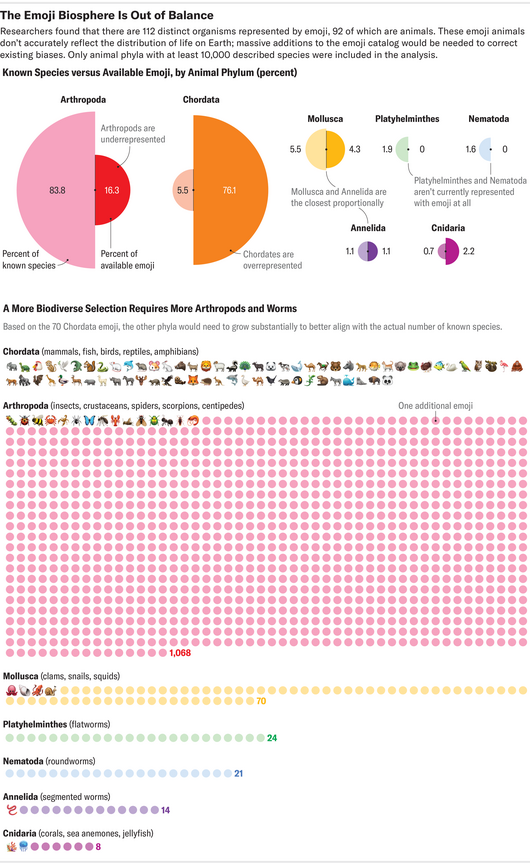 View projectThis data visualization is part of a story published online by Scientific American in January 2024. It first compares the number of animal emojis, by phylum, available to use and their actual...
 -
 View projectOn Wednesdays, we analyze data. This interactive data visualization transforms the iconic Burn Book from Mean Girls into a playful deep dive into the movie’s data. Instead of high school drama,...
 -
 View projectBringing the rhythm of Hamilton to life through data, this visualisation transforms the show’s vocal dynamics into striking waveforms. Inspired by the sine waves that carry sound, each song takes...
 -
 View projectThe work is part of a triptych of visualizations studying the colors of national flags. Each color has a specific meaning, so the aim was to understand which colors appear on the flags of countries...
 -
 View projectThis project, developed in partnership with Crankstart—a San Francisco-based family foundation dedicated to fostering a just society—leverages data visualization to address the city's complex...
 -
 View project"Who is My Neta?" is a dashboard for India's 2024 general elections that helps voters access comprehensive information about their representatives. By combining parliamentary performance data with...
 -
 View projectBuying a bike this spring helped me rediscover the joy of cycling. My favourite thing is to go to Otwock, my home county 20 km south of Warsaw, and do small bikepacking tours. The county is...
 -
 View projectAn interactive web-based map that explores New York City’s honorary street names using LLM, revealing the histories and cultural significance behind them. In an ever-changing world with new AI...
 -
 View projectThe visualization, titled CO2 Emission per Capita, examines the carbon emissions per capita of the top 30 emitting countries from 1998 to 2020. Each country is represented by a bell-shaped...
 -
 View projectThis study explores the relationship between human communities and natural ecosystems, focusing on what happens when they intersect. We aim to understand how conflicts and losses are seen and...
 -
 View projectThis project visualizes the HSBC World Rugby SVNS 2024/2025 Men’s Standings after the Dubai and Cape Town events, using R (ggplot2) and Figma. The radial bar chart represents accumulated points for...
 -
 View projectDrone shows are becoming an increasingly popular way for cities to celebrate events. As an alternative to traditional fireworks, they are much safer and eco-friendly. Furthermore, they are...
 -
 View projectThis viz was created to celebrate the 20th anniversary of Australian artist, Missy Higgin's album, The Sound Of White. It shows the attributes of all tracks using data from Spotify.
 -
 View projectHow can you make the SDGs accessible to a broad audience and captivate 25,000 visitors? The answer: through compelling VISUALIZATION, an interactive GAME SHOW, and hands-on ENGAGEMENT. The SDG...
 -
 View projectTelegram has evolved from a simple messaging app into an aggregator of news, blogs, corporate chats, stores, and various applications. Telegram channels are growing rapidly, and now we start our...
 -
 View projectThe editorial project is focused on Valpolicella, an area situated in Verona province. The purpose is to explore the use of narrative maps as a tool for transmitting spatial information. The aim...
 -
 View project1 in 292 Million is an in-depth exploration of lottery systems in America, examining the structure and impact of the Powerball lottery. Through data analysis and visualization, the project...
 -
 View projectThis 24-page unofficial booklet of Anaïs Mitchell’s Broadway hit "Hadestown" features a narrative set of data visualizations to engage a long-time fan in the behind the scenes magic of a Broadway...
