
This visualisation is a celebration of my first 150 visualisations on Tableau Public. It gives a playful nod to my Scottish location, resulting in a tartan-like design made up of 150 squares....
-
 View projectThe Tour de France features a number of “races within the race” beyond the overall competition for the winner’s yellow jersey. There are other winner’s jerseys for the best young rider, the best...
 -
 View projectThe Data Designer is a mobile-first interactive survey developed by Munus Shih, Richard Lehmann, Allison Connell and Matt Owen of Athletics. It allows the user to create bespoke animated data...
 -
 View projectFashion may strive for glamour, but the industry is one of the world’s largest greenhouse gas polluters. Over the past two decades, the number of new garments made per year has nearly doubled. Fast...
 -
 View projectThe visualization "Cast & Crew IMDb Trends" explores over 132,000 movies from imdb.com. The goal of the visualization is to show top actors, actresses, or directors based on selected parameters...
 -
 View projectThe Paris Agreement is a legally binding international treaty adopted at the UN Climate Change Conference (COP21) in France in 2015. Its goal is to limit the average global temperature increase to...
 -
 View projectThe project analyzes air quality trends in Nuevo León from 2019 to 2024, focusing on PM2.5 concentrations in the Monterrey metropolitan area. It examines variations across monitoring stations,...
 -
 View projectGlobal warming is projected to rocket past the 1.5 °C limit, throwing lifelong activist Andrew Boyd into a crisis of hope, and off on a quest to learn how to live with the “impossible news” of...
 -
 View projectDataviz Inspiration aims to be the largest collection of chart examples online. It currently features around 200 of the most beautiful and impactful dataviz projects I know. Think of it as...
 -
 View projectThis project dives into the vibrant world of speedrunning—the art of completing video games as quickly as possible. Using data from speedrun.com, the analysis explores trends, community dynamics,...
 -
 View projectClimate change continues to pose a significant challenge, especially in India which is highly vulnerable to climate extremities. However, active steps can be taken to mitigate the effects of...
 -
 View projectThis article examines evidence of sexual violence during the Hamas attacks on Israel on October 7, 2023, and the captivity of female hostages in Gaza. Through careful analysis of witness accounts,...
 -
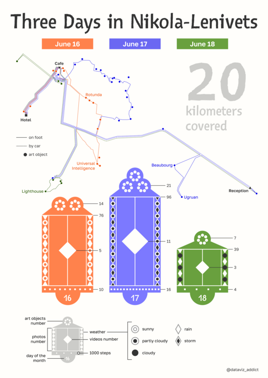 View projectThe poster is dedicated to a personal trip to an art park with landscape installations. Art objects are located in the open air, harmoniously coexisting with nature. I went to Nikola-Lenivets in...
 -
 View projectWith the advent of Fast Fashion which is cheap and accessible do we sit back to think and analyze the true cost of fashion. In this viz we breakdown the environmental cost and the cost of...
 -
 View projectKochi, a bustling coastal city in the Southern part of India, grapples with a growing waste crises threatening its charm, heritage and sustainability. This project dives deep into the city’s waste...
 -
 View projectSchool shootings in the U.S. are more than statistics—they are devastating events that shatter families and communities, leaving many questions unanswered. My interest in this topic stems from a...
 -
 View projectA project exploring income inequality in countries through the Palma Ratio, represented with an experimental tangible visualization, transforming income disparity into engaging narratives to...
 -
 View projectFor many, understanding code is difficult, and yet it is the backbone of the devices we continue to rely on every day. At the same time as code has grown in complexity. Exploring Hidden Worlds...
 -
 View projectGentrification and residential tourism are reshaping Costa Rica’s North Pacific coast, driving up property values and altering the fabric of local communities. "A paradise for sale" visualizes this...
 -
 View projectThe "Call Center Dashboard," built using the #RWFD dataset in Tableau, provides a comprehensive view of a fictional call center's performance during March 2024, with a strong emphasis on delivering...
 -
 View projectLove Across the Eras is a data-driven exploration of how Taylor Swift expresses love throughout her ten musical eras. By analyzing key metrics such as Spotify’s Valence score—which measures a...
 -
 View projectThis visual provides a glimpse into the lives of women in 8 Pacific Islands States (Kiribati, Marshall Islands, Micronesia, Nauru, Samoa, Solomon Islands, Tonga and Vanuatu), and the challenges...
 -
 View projectThis animation shows the party affiliation of the elected candidates in the 2022 U.S. House of Representatives Election. It starts with a choropleth map with each congressional district in its...
 -
 View projectThis data-driven visual narrative explores the evolution of urban mobility, highlighting electric vehicle adoption, public transport expansion, and sustainable city planning. Through striking...
 -
 View projectSince When Does Vogue Hate Text" investigates whether the amount of text on the covers of US Vogue magazines has changed over time. Through this analysis, readers are invited to explore how...
 -
 View projectHow many children would you have? The US Bureau of Labor Statistics questioned young adults about how many children they expect to have. This work compares expectation vs reality.
 -
 View projectCosmic voids are vast spaces that contain few or no galaxies—less than one-tenth of the average matter density found in the Universe. They may have been formed by oscillations of matter during the...
 -
 View projectWhat is there to love in freediving? It turns out quite a lot according to the freedivers Dive deep into the reasons why many fell in love IronViz 2024 submission
 -
 View projectThis visualization shows the ten cities which registered the greatest changes for the yearly maximum value of land surface temperature (LST) in 2018, compared to 2022. LST is how hot the “surface”...
 -
 View projectAmid the staggering loss of life and urgent humanitarian crisis in Gaza lies the catastrophic destruction of places integral to Palestinian life. This story, done in collaboration with Visualizing...