
W-Hysteria is a research catalogue documenting the public debate surrounding the planned removal of an 80-year-old wisteria in Piazza Baiamonti, Milan, due to the construction of the National...
-
 View projectThe goal of this interactive data visualization and dashboard was to simplify and make relatable a complex set of data demonstrating how women spend a larger portion of their lives in poor health...
 -
 View projectOn a college campus, there are few things as popular as reusable water bottles. With social media trends constantly evolving, there is always “the” water bottle being toted around by students....
 -
 View projectWhisky is more than just a drink; it's a story of craftsmanship, tradition, and landscapes. In creating this map, I aimed to follow this narrative by combining a precision of geospatial data with a...
 -
 View projectThe best solutions to climate change also come from the most ordinary places. In collaboration with Voilà:, the Canadian Climate Institute has developed a new report on the impact of today’s...
 -
 View projectOur personal memories of a place are situated in fleeting sensory experiences – the waft of the petrichor, bird songs scoring the background, bakery aromas, sounds of traffic and footfalls whizzing...
 -
 View projectThe story of one of the world’s most popular fruits reveals a history of inequality, exploitation, and foreign control. This project maps how the United Fruit Company established itself in Latin...
 -
 View projectEach civilian life lost in the war in Ukraine, caused by Russia’s full-scale invasion that began on February 24, 2022, carries a story—of someone who should still be here. This project aims to...
 -
 View projectGodzilla is a worldwide pop culture icon that originates from Japan back in 1954. Over the years we have seen 46 film releases, but the question is.. how many Godzilla films is too many?
 -
 View projectThe North of UK has continually seen less investment in transport infrastructure. Here we examine the rail commutability of various UK cities and determine whether regional differences exist.
 -
 View projectA century has passed since the Summer Games graced Paris, heralding their triumphant return in 2024. This resurgence unfolds against the backdrop of a vastly altered world stage, characterized by...
 -
 View projectThis visualization illustrates the impact of the U.S. Supreme Court Dobbs decision and subsequent state laws, such as the Florida 6-week abortion ban, on abortion access in the United States. It...
 -
 View projectThe U.S. has a long history of droughts that have impacted humans and ecosystems. But in the last 100 years, five periods of drought stand out in their effects on agriculture, wildfires, and...
 -
 View projectI grew up in the dense neighborhoods of South Calcutta, and always felt the gradual decline in the greenery around the city. Most of us Calcuttans have no backyard, and with local parks and open...
 -
 View projectThis infographic provides a clear overview of the 2024 EU elections across all 27 member states. It highlights key details such as election dates, the number of MEPs to be elected, voting rules for...
 -
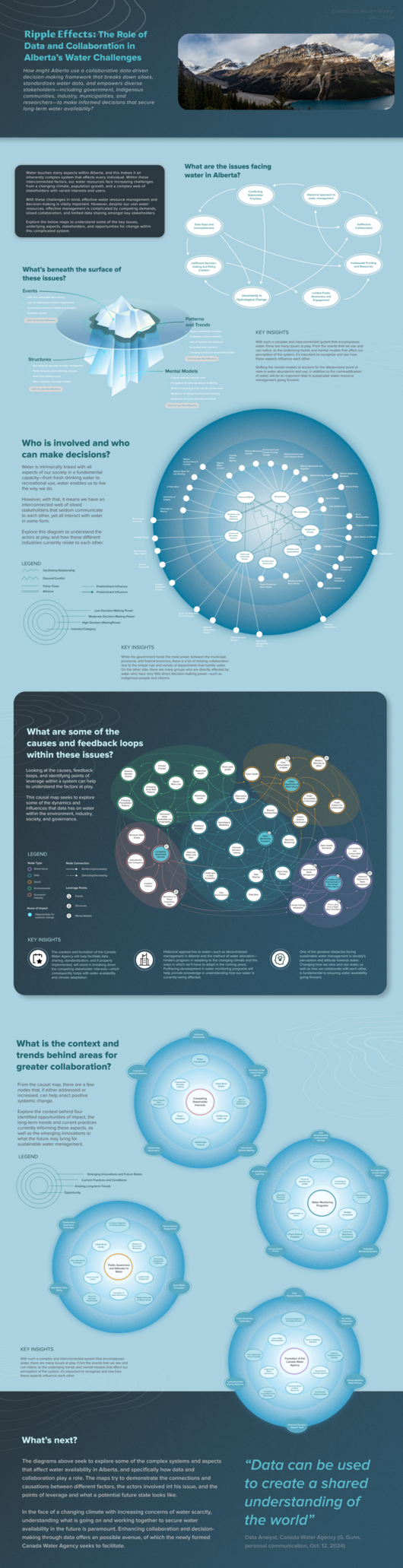 View projectWater is a fundamental resource that shapes ecosystems, industries, and individuals. However, managing this currently plentiful resource in Alberta is increasingly complex due to the impacts of...
 -
 View projectPride flags are powerful symbols of identity, unity, and visibility for the LGBTQ+ community. Originating with the rainbow flag created by Gilbert Baker in 1978, these flags have evolved to...
 -
 View projectThe dashboard is based on parsing IT job data for the Russian-speaking market. All vacancies are sourced from the website getmatch.ru, where job listings are published daily in various countries....
 -
 View projectYouth unemployment remains a persistent challenge in India entangled in a complex web of social, political and economic factors. These include inadequate support systems, bureaucratic...
 -
 View projectHilando Datos addresses the environmental and social issues of the textile industry through a detailed analysis of the six stages of the garment life cycle. This project was born in Datalab, the...
 -
 View projectThis dashboard provides an in-depth analysis of crime trends in Atlanta from 2009 to 2020, focusing on the most common offenses reported to the Atlanta Police Department. Visualizing yearly...
 -
 View projectThis series of four posters was designed as introductory visuals to complement the texts of the "Future Scenarios" project (https://zukunftsbilder.net) by the German Scientists For Future and other...
 -
 View projectThis visualization takes you through the five phases of my life, and illustrate why video game hold such a special place in my heart. This is a journey of self discovery through video games.
 -
 View projectA multifaceted crisis has disrupted vital sea trade routes in early 2024, driven by a convergence of geopolitical tensions and climate change. Recent attacks on ships in the Red Sea by the Houthis,...
 -
 View project作品详细展现了慈禧太后经历的三场战争和她实施的主要政策,结合清朝背景与传统卷轴设计,生动地呈现了她的政治生涯与她对清朝的深刻影响。用元宝作为换算单位:一枚铜钱代表五十万两银元,一个元宝代表一千万两银元对金额进行统计,准确地呈现了那段特殊的历史时期中国割地、赔款的数据。画面右侧整理并统计了当时中国同各个国家签订的不平等条约,用数据反映历史,兼具了数据的准确性、严谨性与视觉的魅力。这种结构化的呈...
 -
 View projectIn recent years, the definition of Extreme Weather Events has become a recurring theme in our daily news. Severe phenomena such as tornadoes, floods, droughts, heatwaves, and wildfires are becoming...
 -
 View projectThe infographic is structured on 2 levels: one more internal, relating to the 2021 figure, and one more external, showing the trend compared to the figure 10 years earlier. The structure of the...
 -
 View projectBuying a bike this spring helped me rediscover the joy of cycling. My favourite thing is to go to Otwock, my home county 20 km south of Warsaw, and do small bikepacking tours. The county is...
 -
 View project'Access & Beyond' is a data-driven narrative that tracks India's incredible journey toward near-universal electrification, with access to electricity to 99% of its population. The project...
 -
 View projectThis visualization captures the data universe of data professionals, represented by 347 stars symbolizing attendees of DataCon 2024 in Thailand. DataCon 2024 aims to connect change-makers and...