
The "Call Center Dashboard," built using the #RWFD dataset in Tableau, provides a comprehensive view of a fictional call center's performance during March 2024, with a strong emphasis on delivering...
-
 View projectThe submitted interactive visualization shows statistical data about Gender Equality. Each ‘flower’ represents the evolution of the ‘seats held by women in national parliaments and governments (%)’...
 -
 View projectThis high-resolution grid map visualizes the share of young people (ages 15-24) across Germany, using a graduated blue color scale to highlight areas with a higher proportion of youth. Lighter...
 -
 View projectViz For Social Good (VFSG) is a non-profit that helps mission-driven organisations create social change through data visualisation. VFSG runs several projects each year, each of which focuses on a...
 -
 View projectBlood donations are essential for healthcare, but supply and demand often fluctuate. This visualization examines South Korea’s blood system by comparing donation levels to surgical demand. The...
 -
 View projectThe Central Committee is the most important leadership body in China's politics; within this committee, the 24-member Politburo is elected, who represents the pinnacle of power. Our first step was...
 -
 View projectAn ambient, animated map that reveals the city’s transit rhythms. Leverage NYC open data, the map turns hourly ridership data into a dynamic, time-driven map. Each station is represented as a point...
 -
 View projectDrone shows are becoming an increasingly popular way for cities to celebrate events. As an alternative to traditional fireworks, they are much safer and eco-friendly. Furthermore, they are...
 -
 View projectThis visualization examines global energy consumption trends over two centuries, highlighting the dominance of non-renewable energy sources and the gradual rise of renewables. It provides a...
 -
 View projectW.E.B. Du Bois, a sociologist, writer, and Pan-Africanist civil rights activist, organized "The Exhibit of American Negroes" at the 1900 Paris Exposition. This project recreates some of his...
 -
 View projectDexter Morgan, everyone's favorite blood spatter analyst and serial killer, captivated audiences throughout his run on Showtime (until the controversial finale, that is). The show’s masterful blend...
 -
 View projectData visualization project for Al Majalla magazine, October 2024. Created in collaboration with illustrator Eduardo Ramon, this project presents a visual narrative that quantifies the devastation...
 -
 View projectA 3D-printed version of the map that appeared in John Snow's "On the Mode of Communication of Cholera" in 1854, showing deaths centred around the water pump at Broad Street.
 -
 View projectThe Australian magpie is known for being aggressive and swooping people every spring. Do magpies mean to hurt us? I decided to answer this question using mathematics. At my school there is a bad...
 -
 View projectThe article on the asylum situation in Hong Kong was crafted with the intent of shedding light on the struggles faced by asylum seekers in the city. By sharing personal accounts, it seeks to evoke...
 -
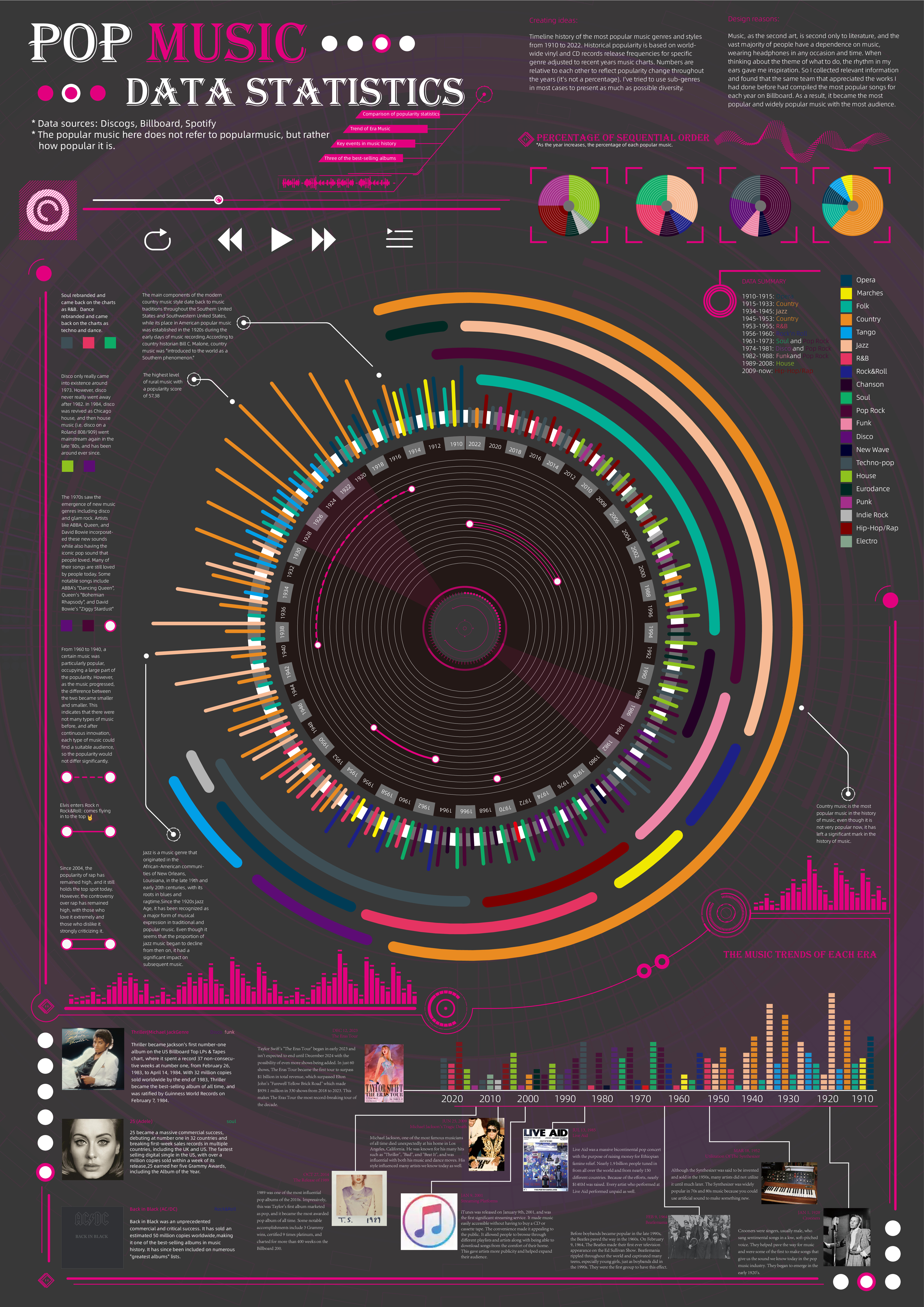
 View projectTimeline history of the most popular music genres and stylesfrom 1910 to 2022.Historical popularityis based on world-wide vinyl and CD records release frequencies for specificgenre adjusted to...
 -
 View projectIn what Maps.com calls “an exemplary experience for public communication,” this interactive website developed by the USGS Vizlab highlights the location of beverage-bottling facilities in the...
 -
 View project'Anatomía de una actuación' is an interpretative histogram, a simple infographic exercise based on admiration for the work and creativity of the actress Ana López Segovia and her Carnaval de Cádiz...
 -
 View projectThis AR visualization is an attempt to transcend traditional static displays and immerse visitors in the stark reality of ocean plastic pollution. The experience aims to educate and inspire action...
 -
 View projectThis visualisation shows the Holocene volcanoes of Japan as illuminated points atop shaded relief. The visualisation is created using the free and open-source R statistical computing language,...
 -
 View projectAs part of a Viz for Social Good challenge for the Global Deaf Research Institute, this data visualization highlights the major unmet need in the deaf community of Nigeria in accessing healthcare...
 -
 View projectAn American entrepreneur Ruth Handler designed Barbie, a fashion doll that was first introduced in 1959 and is now produced by Mattel. Barbie dolls are Mattel's most popular and successful...
 -
 View projectHow would be the perfect selection of candies to give away on Halloween to make everyone happy based on a survey.
 -
 View projectA Cry For Help is a set of seven illuminated sculptures that highlight the issue of insect population decline. Across the world, insect numbers are plummeting because of pesticides, habitat loss,...
 -
 View projectThe website "Destino: Rio de Janeiro" highlights the city's role as a host for major international events, exploring the economic and social benefits these events bring to the population. Using...
 -
 View projectWhat if the bond between two people could be traced as a tactile timeline, making it's data story accessible to others and allowing them to explore it with their own hands? My friendship with C....
 -
 View projectAlana is a socioenvironmental group that strives for a better world for children. They prioritize sustainability, equality, and human and children’s rights. Alana invited us to develop a 28-page...
 -
 View projectThe website 1kg – The Hidden Costs of Consumption uses infographics to explain the environmental and economic impacts of meat consumption. Inspired by the pioneering work of Otto Neurath and Gerd...
 -
 View projectThe Color of Wealth research series—produced by Graphicacy for the Institute on Race, Power, and Political Economy at The New School—examines wealth by race, ethnicity and national origin in the...
