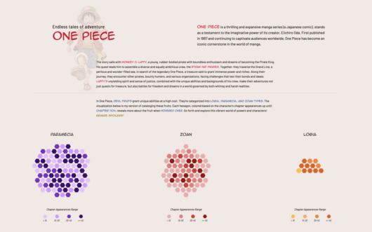
Explore One Piece: Devil Fruit Catalogue, a fun interactive tool that brings the fantastical devil fruits of One Piece to life. Reigniting my love of the series through the Netflix adaptation and...
-
 View projectData visualization project for Al Majalla magazine, published in September 2024. This article features two data visualizations. The first, How AI is Draining the World of Its Energy Sources,...
 -
 View projectWhat is the most common score in football matches? The "International Football Results" visualization can answer this question, as it compiles the results of 47,400 international men football...
 -
 View projectMy infographic shows changes in labour force participation rates in India compared to similar countries. This visualization highlights the gender gap in workforce participation over multiple years,...
 -
 View projectBirthdays are special days to celebrate you! Whether your birthday falls on a rate date, like December 25 or January 1, or a more popular one, like many says in September, you're never partying...
 -
 View projectBeads have been used as a form of currency throughout history, and women often use jewelry as powerful symbols of their authority in male-dominated spaces (think power pearls, RBG). For these...
 -
 View projectImagine turning the screen-time dynamics of the show "The Office" into a visual journey through Dunder Mifflin! This data visualization project dives deep into the shared screen time among...
 -
 View projectGeneral elections were held in India from 19 April to 1 June 2024 in seven phases, to elect all 543 members of the Lok Sabha. As India awaited the outcome of the 2024 General elections, this...
 -
 View projectWhich topics capture the attention of Americans during US election years? And how have our interests shifted from one election cycle to the next? This project investigates these questions with the...
 -
 View projectNature & Networks imagines mycelium network characteristics through collaborative drawing, highlighting the network's unique abilities to stretch in all directions, decompose natural waste and...
 -
 View projectThis visualization reimagines how we understand book genres through the lens of network science and data art. By analyzing bestseller data and user-generated book labels from Open Library's API, we...
 -
 View projectThis work is an information visualization design in traditional Chinese colors, our IDEA is based on the traditional Chinese design concept - “藏礼于器” ("materialization of materialization of...
 -
 View projectThis map visualization depicts the human cost of the Israeli-Palestinian conflict from 2008 until October 7, 2023, the date of the large-scale Hamas attack that precipitated the current crisis. The...
 -
 View projectThe Friendship Atlas is a project that looks at how young people in India's urban cities think and feel about their friendships. This project aims to stir a conversation about those unspoken...
 -
 View projectVisualizing high-dimensional geographic data with associated unstructured textual and quantitative attributes, such as Points of Interest (POIs), is challenging. Through a formative user survey and...
 -
 View projectAfter a Boston Green Line train derailed October 2024, I started wondering each time I boarded the train: How dangerous are Green Line derailments, and do they happen as often as it seems? I...
 -
 View projectSpain at Flood Risk is an interactive and data-driven journalistic investigation that exposes the vulnerability of over a million homes in Spain to river and coastal flooding. This project,...
 -
 View projectThis poster illustrate some anonymized data provided by the New Caledonia South Province Domestic Violence Treatment Service, Le Relais. They focus on women under the age of 30 who have experienced...
 -
 View projectIn the 20th century, more than two million whales were hunted, threatening several species with extinction. This visualization highlights the scale of this exploitation by tracing the catches of...
 -
 View project"SeriHub" is an interactive website prototype that allows users to explore silk production through choice and discovery. The project presents the audience with a choice: produce silk or let the...
 -
 View projectThis video data visualization project presents a unique, abstract interpretation of a star’s life cycle, using dynamic visuals to explore its formation and evolution. The journey begins with a vast...
 -
 View projectTributary poster for Nicolas Feltron, renowned for his “Annual Feltron Reports”, is a pioneering information designer whose work has shaped the way we understand personal data storytelling.
 -
 View projectNew data from WRI finds that in most cities, the difference between 3 degrees C and 1.5 degrees C of warming is sizable. We analyzed potential climate hazards for nearly 1,000 of the world’s...
 -
 View projectWhat if we could wear data? What if we could feel it? You are invited to embody data through fashion and wearable technology! Five corsets on display are available to try on. Each “corset”...
 -
 View projectThe U.S. has become a major transshipment point for Chinese-made chemicals used by Mexico’s cartels to manufacture fentanyl. Narcos have pulled it off by riding a surge in e-commerce that’s...
 -
 View projectThis project delves into the 2011 earthquake incident in Sikkim, examining its wide-ranging impact and exploring the factors that contributed to its severity, such as the excessive number of dams...
 -
 View projectThe world's biggest iceberg - more than twice the size of Greater London - is on the move. A23a, as it’s known, broke away from the Antarctic coastline way back in 1986, yet for more than three...
 -
 View projectThese infographics show the constellations of various countries around the world. The data used to create the maps draws on areas of artificial brightness, which occludes the visibility of stars in...
 -
 View project"The Language of Design Internships" is a set of playful yet informative infographics analyzing the current landscape of design internship listings. These visual tools help young designers better...
 -
 View projectWhy do Russians support the war against Ukraine and what role does Russian propaganda play in this? This was the central question of the data-driven project that analysed over 3 million articles...