
The visualization, titled CO2 Emission per Capita, examines the carbon emissions per capita of the top 30 emitting countries from 1998 to 2020. Each country is represented by a bell-shaped...
-
 View projectExploramos la fusión de arte y fútbol en nuestra cobertura de la Eurocopa en Alemania, inspirándonos en la Bauhaus, y algunos de sus autores como Mondrian y Schlemmer. Utilizamos colores...
 -
 View projectThe maps and visuals in Scientific American’s “Sacrifice Zones” illustrate the catastrophic fallout from a concerted nuclear attack on U.S. land-based missile silos, which are deliberately designed...
 -
 View projectAn infographic driven by citizen-collected election data, revealing how María Corina Machado’s strategy uncovered electoral fraud in Venezuela through data analysis and transparency. Featuring key...
 -
 View projectWhen the media platform Yuvaa approached us to create a data visualisation installation for the Google News Summit, we were excited about making our first physical exhibit! The project was a...
 -
 View projectThe world's transition to a lower-carbon economy will radically transform global production. Decarbonization presents a defining opportunity for economic growth, by creating new industries,...
 -
 View projectSwitzerland has a high-quality healthcare system. At the same time, it is facing major challenges and changes. For the 2023 annual report of the Swiss Centre for Design and Health (SCDH), we...
 -
 View projectSoundbath Britain is an interactive map that plays a custom song generated from near real-time rainfall data from across England, Scotland and Wales.
 -
 View projectThe Everglades, a world-heritage site and largest wetland on the East coast of the United States is not only home to many endangered species but is also a primary source of drinking water for 8...
 -
 View projectOver the years, I’ve had countless conversations with women about their clothing shopping experiences. It’s clear that we all have stories to share about how shopping for clothes impacts our...
 -
 View projectVisualizing UFO sightings across the USA using the provided dataset, analyzed through various parameters such as timeline, date, month, etc. Leveraging Tableau and diverse visualization approaches,...
 -
 View projectThe Metropolitan Transportation Authority (MTA) is the entity that manages the NYC subway, one of the busiest public transportation systems in the world. An unsung, sometimes unnoticed, aspect of...
 -
 View projectTaylor Swift shifts her sound with each album, creating new "eras" in her discography. From her twangy country origins in Taylor Swift to the indie-infused narratives of folklore and evermore,...
 -
 View projectJust like in the UEFA European Championship, the Americas's Cup, or the 2023 Women's World Cup, everything begins long before the event takes place. Pre-Olympic graphics anticipate, months before...
 -
 View projectThis piece captures the structural wiring of the human brain responsible for language processing. It also uses the line density of novel 'spider-web' plots to convey the relative distribution of...
 -
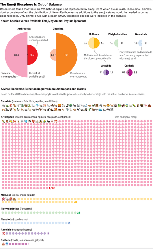 View projectThis data visualization is part of a story published online by Scientific American in January 2024. It first compares the number of animal emojis, by phylum, available to use and their actual...
 -
 View projectThe German governing coalition of the SPD, Greens and FDP repeatedly argued fiercely about money during its time in office. After the start of the Russian war against Ukraine, measures to combat...
 -
 View projectSingapore has a unique policy for public housing which stipulates quotas for the maximum number of households that can be allocated to each race. Called the Ethnic Integration Policy (EIP), it was...
 -
 View projectFashion is an industry obsessed with now and next, even the way we make and consume information. What happened in the past, and over time, might be a good indicator of what's happening now and...
 -
 View projectThe 2024 Shōgun series is a fresh adaptation of James Clavell's 1975 novel, produced by FX Networks. It revisits the complex and dramatic story of the first Englishman to set foot in Japan,...
 -
 View projectAs of December 2024, more than 70,000 dead or missing human beings have been documented by the Missing Migrants Project of the International Organization for Migration (IOM) since 2014. The actual...
 -
 View projectAs Canada races to achieve net-zero emissions by 2050, rooftop solar emerges as a transformative yet underutilized solution for doubling electricity production. With vast untapped potential, solar...
 -
 View projectThe number of public holidays in a nation and why they are observed may tell us about the historical priorities of its people. How about looking at them from a global perspective?
 -
 View projectThis project attempts to visualise the results of an online survey about women's health in a beautiful and functional dashboard. The data were collected by Yonder Data Solutions on behalf of Women...
 -
 View projectThe Ashes is one of the oldest and most prestigious rivalries in the sport of cricket, with a history that spans over a century. This visualization provides an in-depth look at the historic Ashes...
 -
 View project‘Memory Carriers’ explores how image-led data visualization can help preserve shared memories in both analog and digital environments. Building on data humanism (lupi, 2017), the project examines...
 -
 View projectThe Nokia Design Archive is a publicly accessible, online digital portal, created as a research project in the Department of Design at Aalto University, Finland. With items donated by Microsoft...
 -
 View projectThis graphic illustrates the disproportionate impact of family and domestic violence on Aboriginal and Torres Strait Islander people. In 2021-22 - the latest data available - Indigenous women aged...
 -
 View projectExploring the Essence: Insights from Perfume Data Visualization This project explores a fascinating #TidTuesday dataset on perfumes, sourced from Parfumo, a community of perfume enthusiasts....
 -
 View projectIn October 2024, the Urban Institute launched the Upward Mobility Data Dashboard, a tool for local leaders to explore 24 conditions affecting upward mobility from poverty and racial equity in their...