
For the launch of Scena9’s 2024 print issue themed “mistake,” we developed a 5x3m wall print to visualize an article on addiction in Romania. The project aimed to address the scarcity of reliable...
-
 View project“In Search of Place” is an exhibition poster series exploring what elements of spaces are more personally significant in facilitating placemaking processes and making meaningful spaces. The series...
 -
 View projectThe year 2023 has been confirmed as the warmest on record, breaking the previous record set in 2016. This temperature record was driven by human-caused climate change and boosted by the natural El...
 -
 View projectIn this viz we visualize the challenges in communication faced by the deaf community of Nigeria. The data is collected by GDRI which is a pioneering, deaf-led research collaborative conducting...
 -
 View projectOn International Women’s Day, IPG Health visualized the health disparities that women continue to experience globally. From systemic issues to the environment, we look at the root causes for these...
 -
 View projectWorld trade and prosperity have grown unabated for decades. Data cables, pipelines, waterways and satellites make it possible, but the system is vulnerable. An interactive journey with globes and...
 -
 View projectAn unusual interactive visual exploration of self-love and small joys in everyday life, blending personal data, storytelling, and art. This project began with an Instagram account created by Ted...
 -
 View projectA title drop is when a character in a movie says the title of the movie they're in. "Full of Themselves" is a large-scale analysis of 73,921 movies from the last 80 years, exploring how often,...
 -
 View projectDive into the rich history of the Commonwealth Games with this striking timeline, showcasing which sports have been contested in each edition since 1930. This visualisation offers a comprehensive...
 -
 View project"The Arabian Oil Trade" is a data-driven exploration of Saudi Arabia’s role in global crude oil exports. Ever wondered where the oil in your car originates? This visualization takes you on a...
 -
 View projectThis crocheted scarf is a personal data physicalization project created to celebrate the 2023 ski season—my first year back after dislocating a knee in 2022. Data was collected using the Slopes...
 -
 View projectThe best solutions to climate change also come from the most ordinary places. In collaboration with Voilà:, the Canadian Climate Institute has developed a new report on the impact of today’s...
 -
 View projectThis interactive piece provides an in-depth exploration of plastic production and waste management worldwide, with a specific focus on Romania. Through dynamic charts, maps, and projections, the...
 -
 View projectDaphne Draws Data is a children's book that introduces kids to the superpowers of graphs and data storytelling through the adventures of Daphne the dragon. As she turns numbers into problem-solving...
 -
 View projectThe project is a visualisation of the results of the psychological research called "20 Statements Test" (Kuhn & McPartland, 1954), which involved just over 100 students around the world. Their...
 -
 View projectThis visualisation shows the forest cover of New Zealand as circles. The visualisation is created using the free and open-source R statistical computing language, which makes it accessible and...
 -
 View projectThe article explores how artificial intelligence (AI) systems, like Stable Diffusion, are trained using massive datasets, focusing on LAION-5B, a public dataset containing 5.85 billion image-text...
 -
 View projectThis project visualises the power of shade in combating extreme urban heat, blending historical design wisdom with modern innovations. Using data-driven insights, it highlights how trees, canopies,...
 -
 View project"Into the Movieverse" is an engaging data visualization project that explores cinematic statistics for films released between 1980 and 2022. Its intuitive design allows users to delve into various...
 -
 View projectThis visualisation shows the Holocene volcanoes of Japan as illuminated points atop shaded relief. The visualisation is created using the free and open-source R statistical computing language,...
 -
 View projectThe U.S. has become a major transshipment point for Chinese-made chemicals used by Mexico’s cartels to manufacture fentanyl. Narcos have pulled it off by riding a surge in e-commerce that’s...
 -
 View projectWildfires in Bloom is a data story that will take readers on a journey of wildfires, revealing surprising facts through interactive visuals. The narrative will challenge the stereotype of fire...
 -
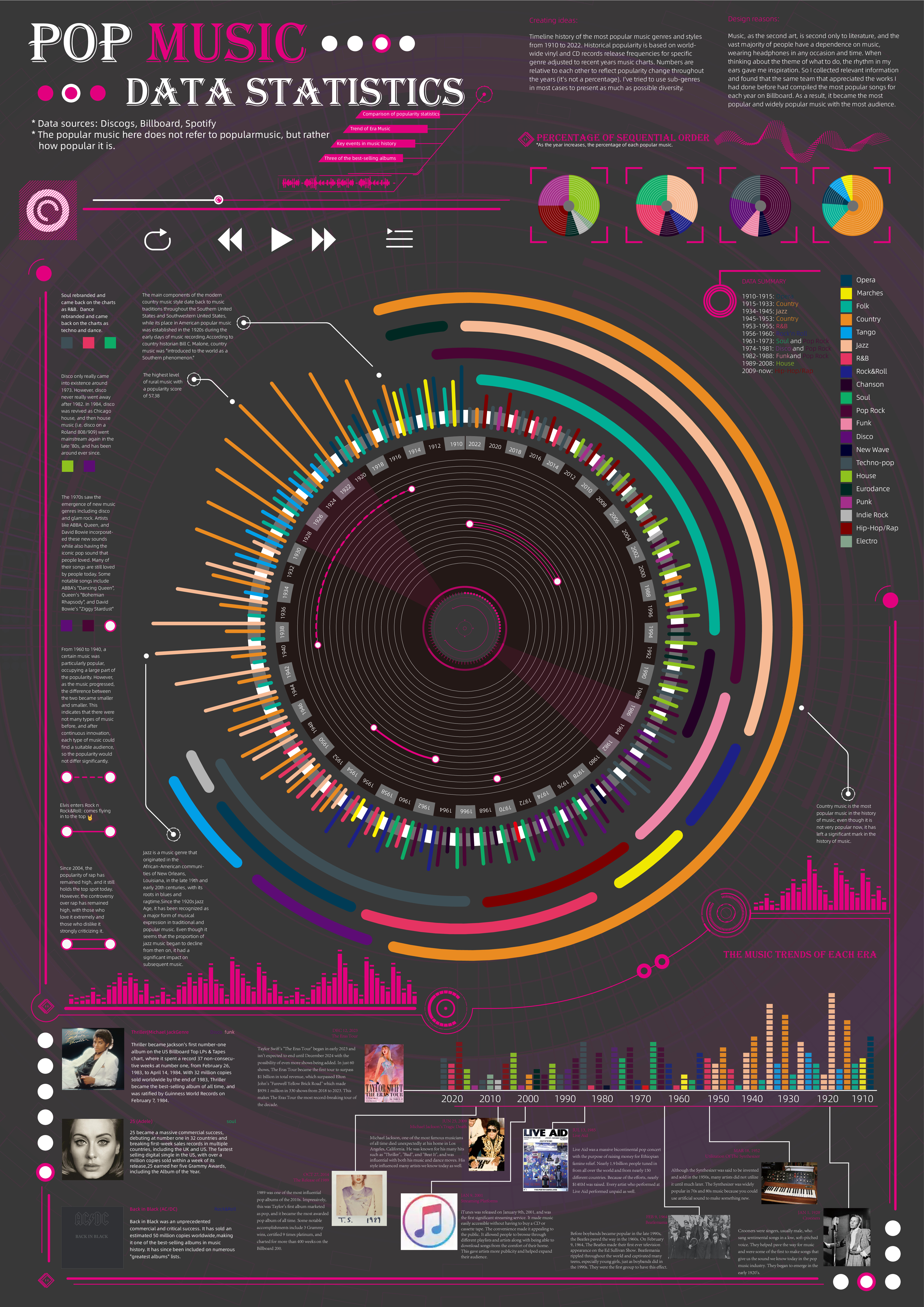
 View projectTimeline history of the most popular music genres and stylesfrom 1910 to 2022.Historical popularityis based on world-wide vinyl and CD records release frequencies for specificgenre adjusted to...
 -
 View projectThis visualisation shows the linguistic diversity of the Arctic, focusing on the main language families, using data from the Arctic Indigenous Peoples Languages and Revitalization project. I chose...
 -
 View projectExplore how Harlequins pulled off one of the greatest comeback in English Rugby Union play-off history. 28 points down after 30 minutes, all looked lost.....
 -
 View projectExpedia partners with information designer Manuel Bortoletti to present its 24th Annual Vacation Deprivation Report. This infographic campaign transforms complex data into a compelling visual...
 -
 View projectThe Artificial Intelligence Cyber Challenge (AIxCC) is a two-year competition that brings together the best and brightest in AI and cybersecurity to design novel AI systems to secure critical...
 -
 View projectImmagine Sonora is a flexible visual system that maps temporal patterns in Spotify music streaming behaviours. It reveals when, throughout the year, people listen to music using real streaming...
 -
 View projectLook into the machine's mind Understanding the inner works of a Large Language Model (LLM) such as Chatgpt could be extremely challenging. But one can learn a lot about it just by running...
 -
 View projectDatabeads is a grassroots initiative that’s all about bringing data visualization into a whole new space—off the screen and into wearable, everyday objects. We’re a couple from Budapest working...