
TypeNow is a student-focused initiative aiming to spread awareness of typeface design and typography – both as practice and profession. Its first issue centers in on typeface design programs across...
-
 View projectDexter Morgan, everyone's favorite blood spatter analyst and serial killer, captivated audiences throughout his run on Showtime (until the controversial finale, that is). The show’s masterful blend...
 -
 View projectDatabeads is a grassroots initiative that’s all about bringing data visualization into a whole new space—off the screen and into wearable, everyday objects. We’re a couple from Budapest working...
 -
 View projectIn 2024, China's first 3A game "Black Myth: Wukong" was released and received widespread acclaim, and won Golden Joystick Awards of the Year in November. The game is based on the Chinese classical...
 -
 View projectThe visual thesis deconstructs the process of trend forecasting in typeface design. It explores the factors driving these trends, from cultural shifts & technological advancements to artistic...
 -
 View projectBioplex is an explorable collection of educational resources on complexity, ecology, systems thinking, and transdisciplinarity. The world needs a new paradigm of thought to tackle its increasingly...
 -
 View projectThis work is an information visualization design in traditional Chinese colors, our IDEA is based on the traditional Chinese design concept - “藏礼于器” ("materialization of materialization of...
 -
 View projectStep into the vibrant world of Eurovision with this data-driven piece - where every flag tells a story, and every bar represents a nation's voice in the ultimate musical showdown. Each country’s...
 -
 View projectChai is the heartbeat of India. But how did this drink become a national obsession? This map-based story narrates its journey through cartography.
 -
 View projectThese miso jars transform recipe data into pottery itself. Each element of the material and form communicates: - Red clay on the lids maps fermentation time (1 circle = 1 year). - Tan clay...
 -
 View projectThe work takes the famous painting of the Ming Dynasty “The bustling Nandu map”, which depicts the prosperous scene of Jinling city business, as a clue, and utilizes the way of information...
 -
 View projectThis project explores the fascinating journey of anime, tracing its origins in Japan and its transformation into a global cultural phenomenon. Once rooted in traditional Japanese storytelling and...
 -
 View projectThe more we observe a city, the more apparent it becomes that it surpasses the sum of its parts. It resembles a colossal, intricate organism with its network of organs and unique internal dynamics....
 -
 View projectTaylor Swift shifts her sound with each album, creating new "eras" in her discography. From her twangy country origins in Taylor Swift to the indie-infused narratives of folklore and evermore,...
 -
 View projectTitle: 2024 World Economic Forum Travel & Tourism Development Index: Regional Performance Trends Description: This interactive dashboard highlights the rankings and performance shifts of...
 -
 View projectThis project analyzes the show Shark Tank and highlights insights from the show's 16 seasons. The visualization features interactive charts with an eye-catching design style. The center-piece of...
 -
 View projectThis infographic is deeply personal, reflecting my Indigenous cultural background, my profound empathy for marginalized communities, and my commitment to healing through design. Inspired by my...
 -
 View projectThe data is presented in a way where each episode is represented by a circle. The size of the circle indicates the viewership for that particular episode, with larger circles representing more...
 -
 View projectProject Santa invites viewers to step into Santa’s boots, exploring the lives of 110 participants as they navigate the joy and loneliness of the Christmas season. Through a series of interactive...
 -
 View projectNew in the field and feeling lost in the labyrinth of choices? No worries! Check out this chart inspired by Agatha Christie's murder mysteries highlighting popular combinations of motives, weapons,...
 -
 View projectImagine turning the screen-time dynamics of the show "The Office" into a visual journey through Dunder Mifflin! This data visualization project dives deep into the shared screen time among...
 -
 View projectStep back in time with this interactive visualization, exploring the rise of the Roman Empire from its late Republic era to its peak territorial expansion. -Dynamic Map & Timeline: Trace the...
 -
 View projectThis visualization explores the language of color in two transformative periods of art history: the Renaissance and the Modernism era. Separated by centuries but sharing a profound devotion to...
 -
 View projectIn this research project, I engaged in a dialogue with the artist Vladimir Weisberg, exploring both his creative journey and my own perceptions and emotions while viewing his work. Vladimir...
 -
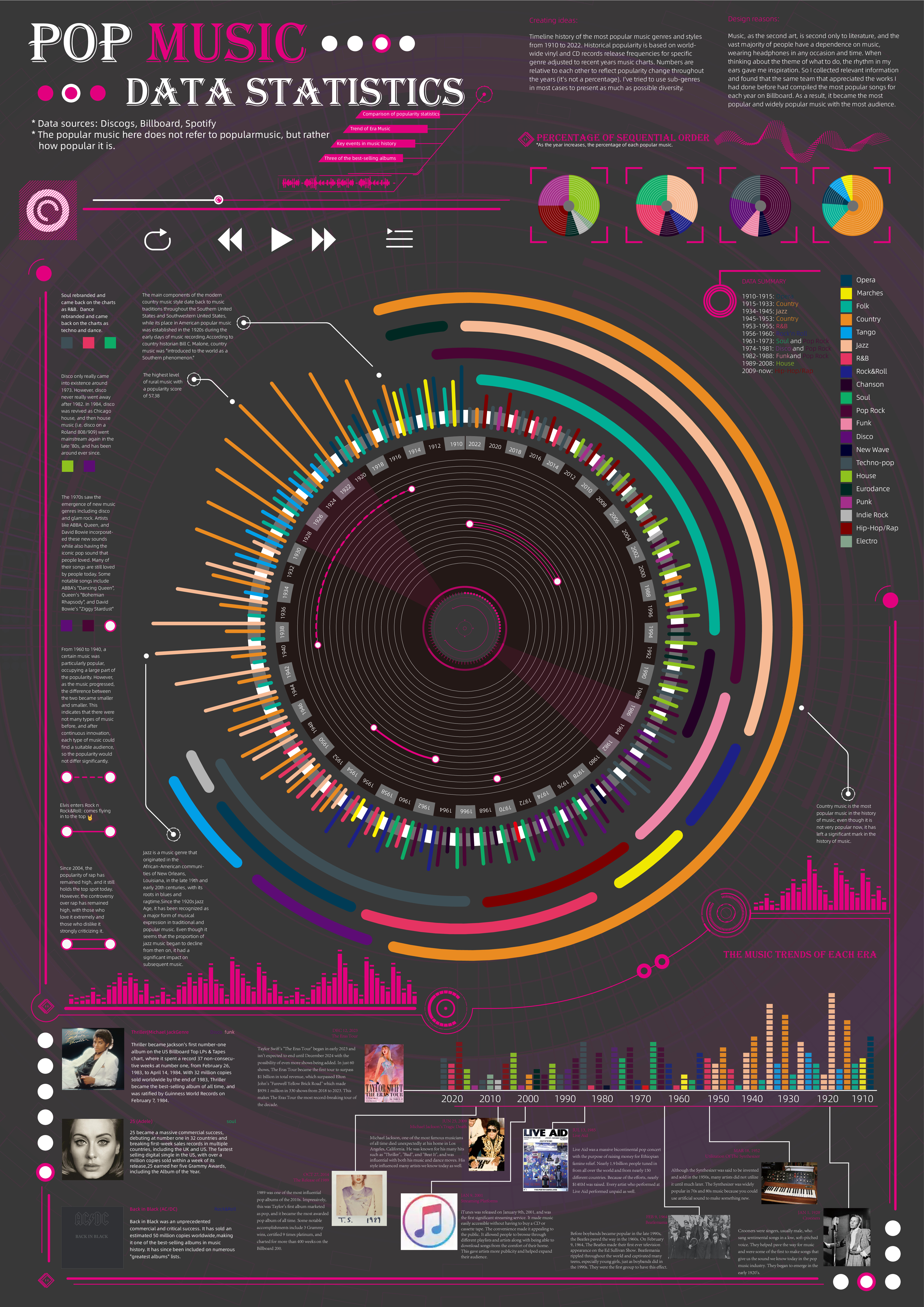
 View projectTimeline history of the most popular music genres and stylesfrom 1910 to 2022.Historical popularityis based on world-wide vinyl and CD records release frequencies for specificgenre adjusted to...
 -
 View projectThe work "IMDB Top Movies" presents the highest-rated movies from imdb.com. It examines movies with a rating of 7.5 or higher, which received 50,000+ votes. In total, just over 1000 films are...
 -
 View projectBringing the rhythm of Hamilton to life through data, this visualisation transforms the show’s vocal dynamics into striking waveforms. Inspired by the sine waves that carry sound, each song takes...
 -
 View projectIn 2023, EVE (the Israeli Association for Independent Creators) initiated a study on independent creators in the field of theater between 2013 and 2023, aiming to create an overview reflecting the...
 -
 View projectThe Art of Perseverance and Relentless Pursuit of Culinary Artistry. This project delves into the prestigious James Beard Foundation Awards, examining the achievements of outstanding chefs in...
