Living Map by Sigitas Guzauskas
Climate change is a very hot topic nowadays. We are facing extreme weather events more and more frequently. Unusual temperatures, excess rainfall or extremely strong winds, forest fires disrupt our habitual life. In the situation like a natural question arises - “What is the future of our living environment?” If we continue our way of life will our environment be habitable at all? Or will we need to migrate to other territories?
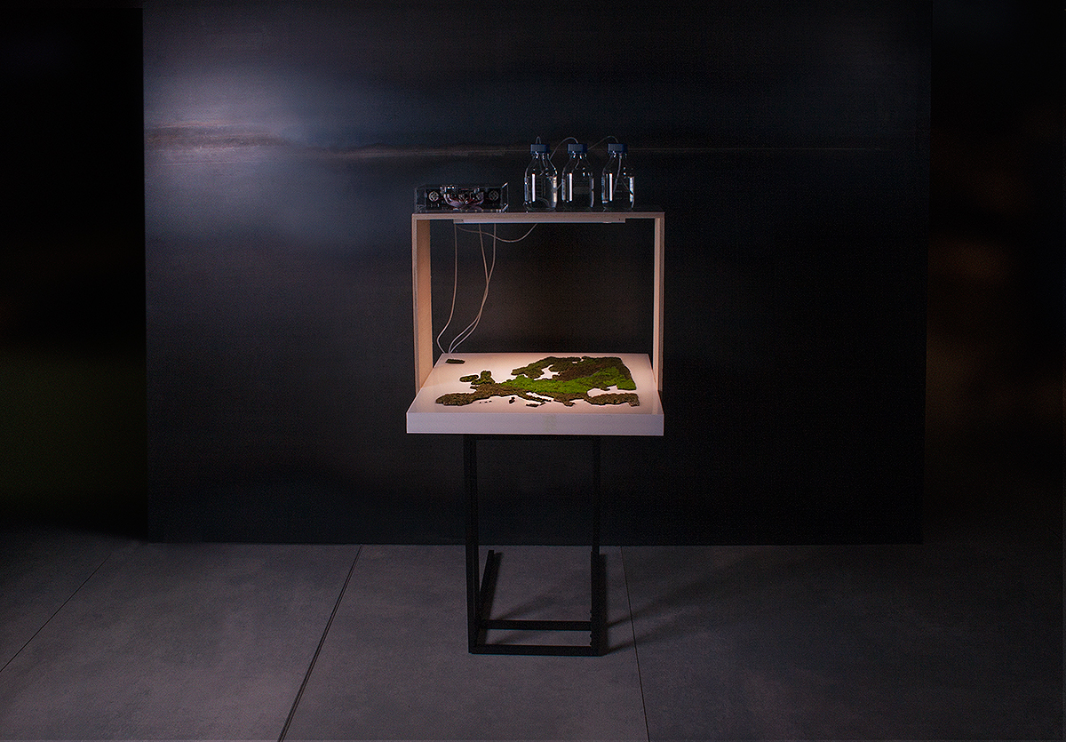
To visualize a possible scenario of a climate change an interactive LIVING MAP was designed. The LIVING MAP visualizes the change of summertime rainfall in Europe. The rainfall data was chosen because precipitation plays a vital role in all human-environment: agriculture, water supply, energy production, tourism and natural ecosystems.
A precipitation data comes from the European Environmental Agency. The data was derived using climate simulation model. It compares summer precipitation in the period 1971-2000 and 2071-2100. The simulation of climate change shows that a southern part of the continent will receive almost 40% less rainfall and the northern part will receive approx. 30% more precipitation. It means an amount of summertime precipitation will change our habitable environment dramatically.
Usually, data visualization reduces any natural phenomena to basic geometric shapes, points and lines. Because of such an extreme schematization, we see any data visualization as “boring” or “lifeless”. Opposite a LIVING MAP project, tries to represent the phenomena in more impactful, memorable and attractive way.
The map is a physical materialization of quantitative data. So, it could be perceived not observing basic geometric primitives but experienced by the much wider spectrum of perception. The map could be touched, smelled, looked around, pictured, meditated etc. The map changes all the time so it looks different any period. I believe that this kind of data representations could pay audience attention to a discourse of climate change more effectively.
For a LIVING MAP data visualization, a local ecosystem was designed. A species of alive fire moss (Ceratondon purpureus) were plated onto a special surface. This type of moss can visually indicate the presence or absence of the water. If the moss receives enough water then it turns green. If it lacks water it turns brown or yellow. Excess of humidity makes the moss almost black. The controlled amount of water was supplied for a moss map. An amount of water correlates with digital data. Different areas of the map received a different quantity of water. In a few months, a special moss pattern on the surface of the map was created. It metaphorically represents the possible environmental scenario in the European continent in 2070.
-
CreditsSigitas Guzauskas
-
Award
-
Categories
-
See more


