Collaborative Branding: An Interview With Fabio Bergamaschi
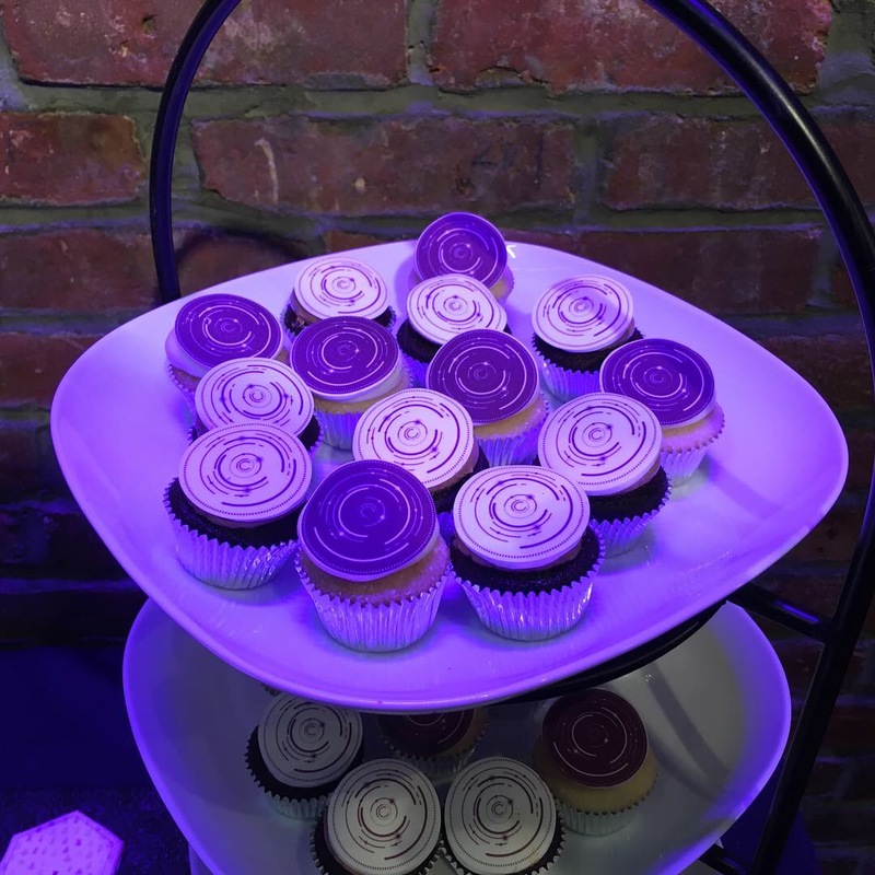
Ever wonder what beautiful design tastes like on top of a cupcake? Information is Beautiful graphics team member Fabio Bergamaschi made that dream a reality for attendees of our 2018 Awards ceremony.
In part 2 of our series on updating the IIB Awards branding, Fabio discusses how he took Mike Brondbjerg's 3D branding for the 2018 Awards and crafted it into the perfect representation of our brand. His work was featured heavily during the opulent ceremony - it was etched onto the trophies, projected onto the floor and ceiling, and (his crowning achievement, we're sure) made into edible cupcake toppers. Our interview with Fabio explores the process of collaboration in a many-faceted design project, as well as his thoughts on inspiration and creating a brand identity.

What role did you play in producing the new Information is Beautiful Awards branding alongside Mike Brondbjerg and David McCandless?
After Mike and David developed the 3D complex images, I was asked to join the team and start working on a new logo for the Awards in order to refresh the general brand identity. The new artwork for the logo needed to be suitable for traditional uses, both online and offline, and of course pair properly with the beautiful art created by Mike.
:: In Mike's interview we explored how the new branding took inspiration from data points based on Awards entries.
Describe the process of collaboration for a project of this type - how did the back-and-forth between you, Mike & David impact the end product?
I felt really inspired by Mike’s design, and that made my creative process much simpler. Basically what I wanted to do was synthesize the beauty and elegance of his animated art into a much simpler and essential image, so I tried to identify the main elements and explore them visually, combining them with different levels of complexity & mixing them in different ways while playing with sizes and colours.
David guided the process and coordinated both of us, suggesting improvements, writing feedback on my many iterations, and adding his touch to the final result.
![]()
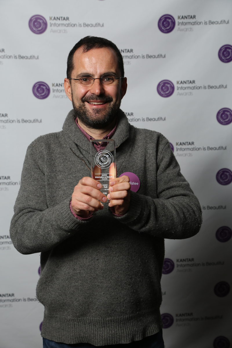
Your work on the brand was a key part of the ceremony - it was part of our new trophy design. Given that it played such an important and tactile role in the ceremony, what were your goals for the end product?
I had three main requirements in mind while I was working on the new logo: 1) It had to be innovative, while mainting the link with our previous identity; 2) It had to refer back to what Mike had created; 3) It had to work well on all our digital and printed materials.
I’ve been working for Information is Beautiful and for the Awards for more than four years now, so I had a clear idea of all of the material we produce for the ceremony, and this made things much easier.
Historia De Zainab wins the Gold - Community Vote.
What were your challenges in producing the work?
Creating a new logo is always a big challenge, especially for a world-renowned event like the Kantar IIB Awards, and especially when there is already a strong and defined identity. I think my main difficulty was the strict timeline - we needed the logo to start producing and printing everything in time for the ceremony, but at the same time we wanted the logo to be perfect. Design is always an ongoing and iterative process, and probably every designer would keep improving his stuff forever if deadlines didn't exist. I don’t exclude that there will be some adjustments and improvements for next year!
I'm very happy with the trophies we produced - I think this year we offered our winners the best version ever. I need to say thank you to the whole team, since the ideation of the new trophies has really been a collaborative effort.
Similarly I was very happy to see my logo working well on the many different outputs we created: from the presentation to the printed newspaper, from light projections to (yes!) the edible prints we put on cupcakes and cookies.
I had so much fun leaving the data visualization field for a while and working on a more traditional visual design project. I’m really proud of what we accomplished and I hope our community appreciated the fresh new identity.