Human Cost Challenge: The Winners
We’re hugely excited to announce the winners and runners up of our Human Cost challenge. Thank you to everyone who entered and for all the hard work you put in.
The challenge was a tricky one – to visualize the price of human life over history, but the results were fantastic.
We had cash prizes, but also the chance to have your design placed in Knowledge is Beautiful (Amazon US | UK), David McCandless’s new book.
Here’s a reminder of the prizes:
Static Visualization:
Winner $1000
Runner Up $500
Interactive Visualization:
Winner $2000
Runner Up $750
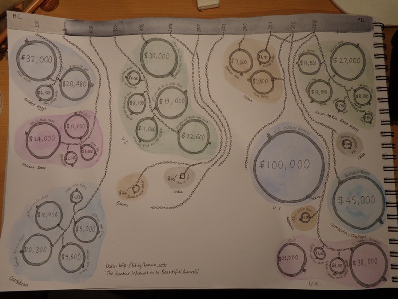
Napkin:
Winner $500
Runner Up $250
And here are the winners! See if your favourite scooped a prize.
Static Winner: Raphaël Halloran ($1000)
“Respectfully minimal. Nicely-grouped comparisons. Nice information flow. Nicely drawn extra silhouettes. Nice!” - David McCandless

Static Runner-up: Tiffany Farrant-Gonzalez ($500)
“A few entries took this approach, but Tiffany’s was the most stylish & elegant. Liked the colours and the ‘classic’ feel.”

Interactive Winner: Carlo Zapponi ($2000)
“Enjoyed the way Carlo wrapped the data into a subtle interactive story. And tackled the problem of variety by allowing unpacking and unfolded of separate data elements. Oh and it looked good and flowed good too!”

Interactive Runner-up: Will Carroll ($750)
“One of the challenges of this data was its variety (different times, different types, wide ranges). Will leveraged some great code to allow meaningful sorting and for a viewer to seek out comparisons.”

Napkin Winner: Julius Ingemann ($500)
“Julius bagged the prize for the inventive way he inverted the question to open up the visualization possibilities. Great creative solution. He also used every single felt-tip in his collection – impressive!”

Napkin Runner-up: Rosamund Pearce ($250)
“I’m not always a fan of ‘on-the-nose’ visual metaphors. But here the sensitivity of the data leant itself to more impressionistic / artistic display. Rosamund’s approach really works and subtly visualizes the data.”